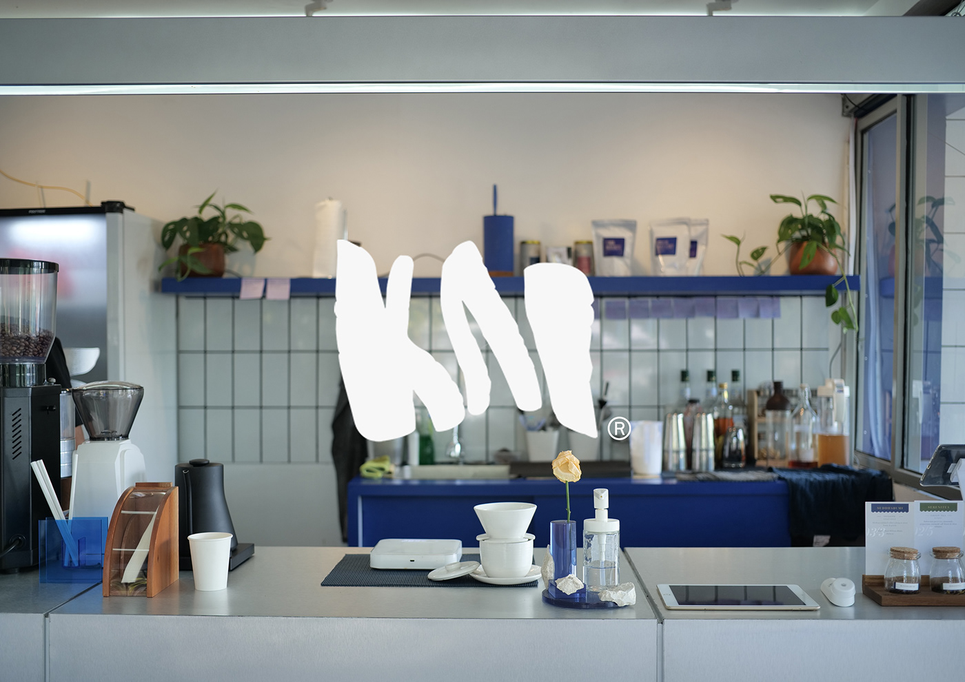
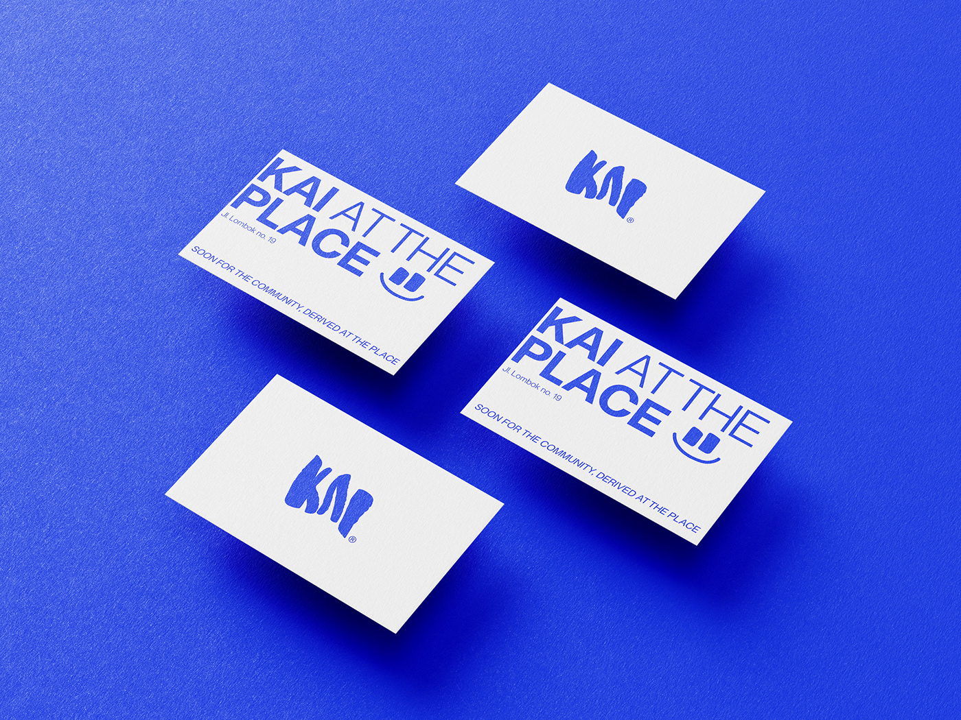
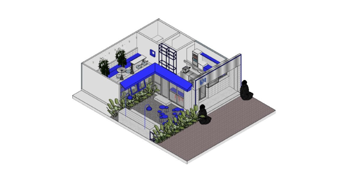
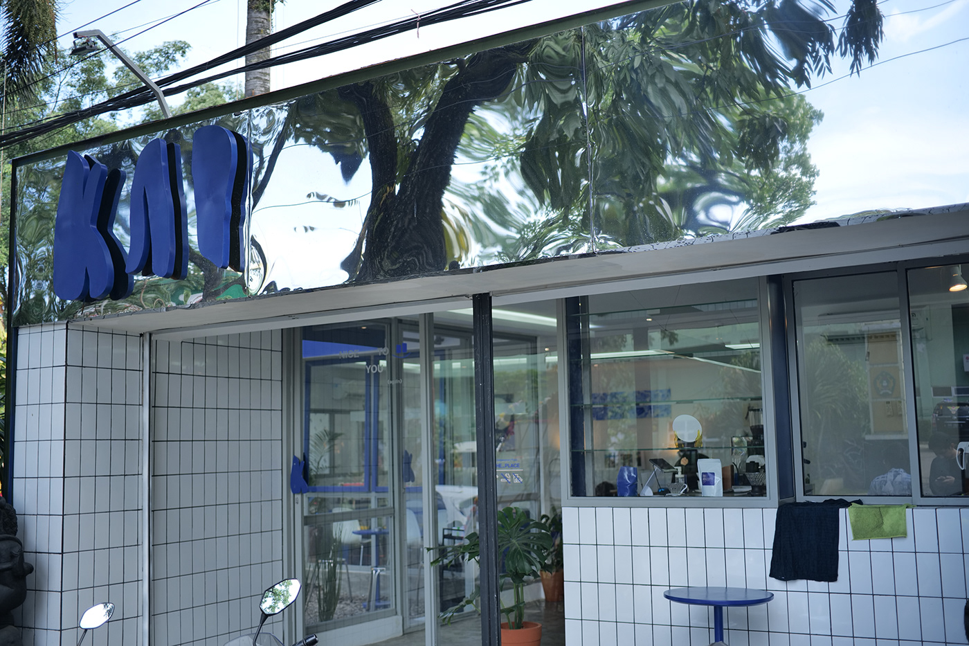
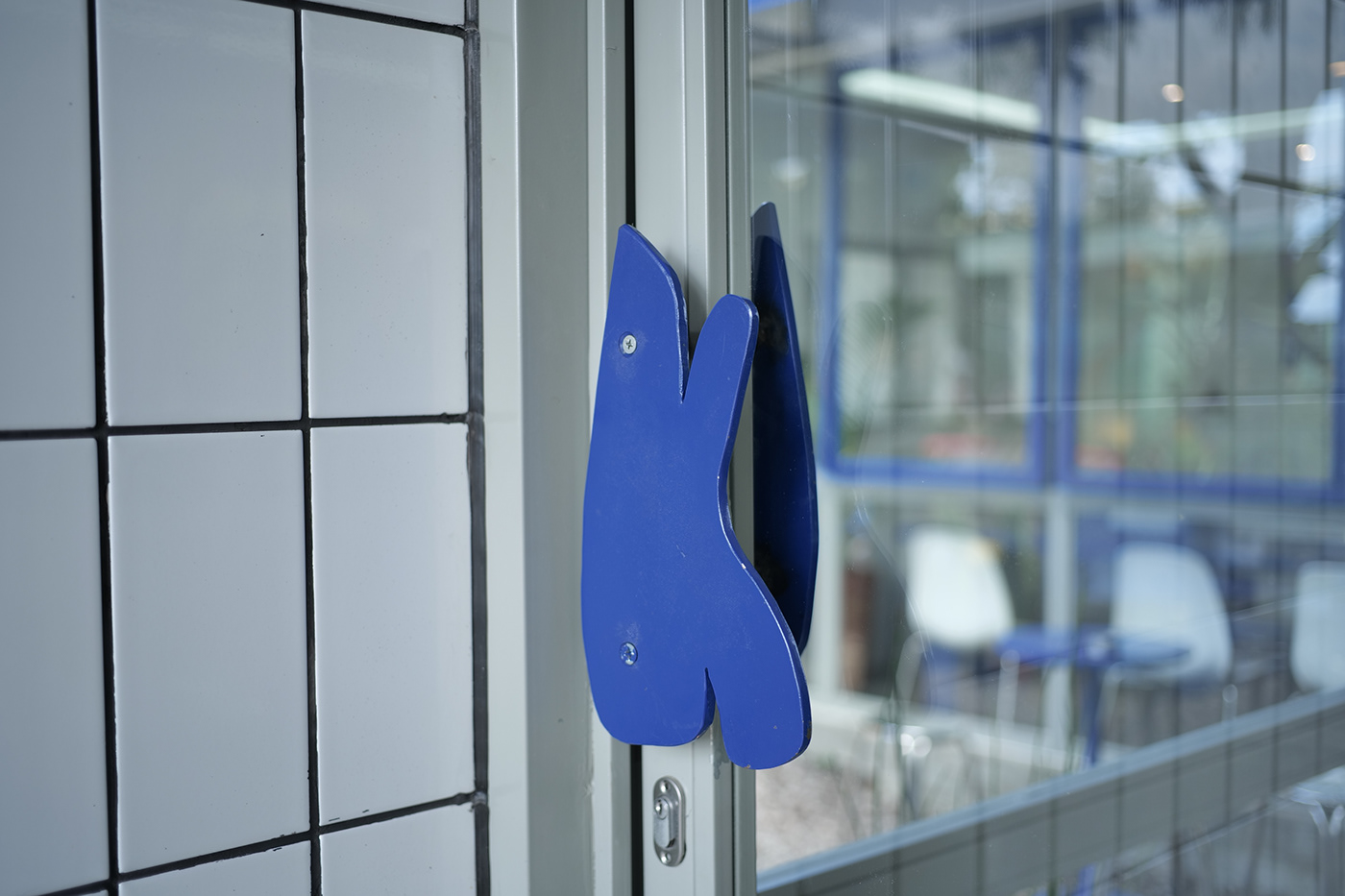
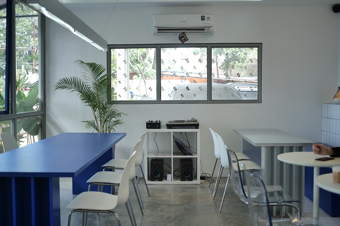
KAI AT THE PLACE is a multifunctional place located in the strategic area of Bandung, West Java which specialized in coffee and food. KAI means happy in Swedish and Ocean in Hawai’i. This brand wants to represent happiness, hence using blue as the primary color of the place. Furthermore, KAI focuses on the sustainability art of flock, which means this place would inspire many young people to create and collaborate while drinking a cup of coffee


©2021 Dure. All Rights Reserved.
Branding & Visual Identity by Dure | Creative Direction by Argianto Fendy Fadia | Graphic Design by Gelar Anugrah & Argianto Fendy Fadia | Interior Design by Velli Siefa | Photography by Argianto Fendy Fadia & Ferdy F. Budiman


